Navigation: The Unsung Hero of Organization
When we think about organization, we usually focus on grouping and labeling. But what if I told you there's a third, equally important element that's often overlooked: navigation? It's the unsung hero of any good system, and as a designer, mastering it is a way to become the architect of your own workflow. Navigation isn't just about getting from point A to point B; it's about organizing the user's entire experience and helping them understand the structure of the content.
The inspiration for this idea came from a frustrating moment on a website where I felt completely lost. The page didn't provide any necessary landmarks or breadcrumbs, and I realized I had no idea where I was or how I got there. This experience taught me that in any organized system, a user needs a clear sense of location to feel secure.


The Digital Hierarchy: Tree vs. Flat
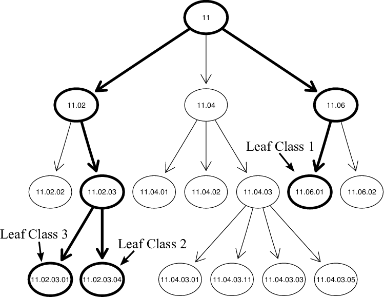
The most common way we organize is with a tree-based folder system, like the one on your computer. It's neat because it hides complexity. You only see one layer of files and folders at a time, making it easy to manage a massive amount of information. However, this method breaks down quickly when the hierarchy gets too deep, turning a simple task into a frustrating series of clicks.
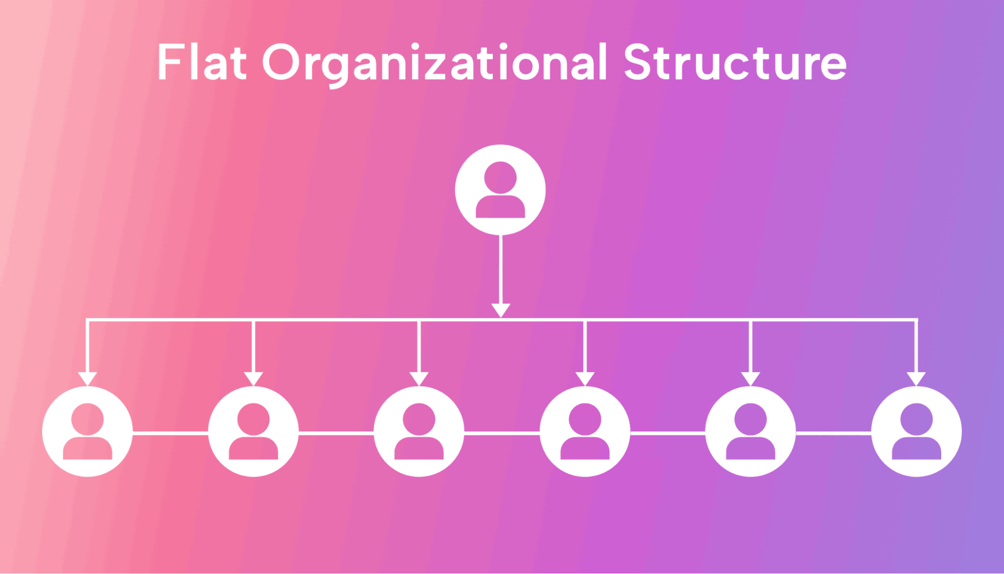
In website design, this is seen in the links you click to go deeper into a page. The page itself, however, often uses a flat hierarchy—a long list of content. This is a very common approach: a tree system first to get to the right page, and then a flat hierarchy to show you all the content on that page. An interesting alternative would be to reverse this: have one long page with all the content, and then a few specific links that take you to deeper "tree" pages. Each system has its merits and downsides, and the best designers know how to use both.
Lessons from the Grocery Store
The best example of a sophisticated navigation system in action isn't a website—it's a grocery store. Grocery stores have a lot of items to organize, and they have to make sure you, the customer, don't get lost. The design of a grocery store is an excellent design lesson in itself, as it combines these different hierarchies into a seamless experience.
Tree System: The aisles themselves are a form of a tree-based hierarchy. You navigate through broad categories like "bathroom supplies" and "dry food," which immediately gives you a sense of where you are in the store.
Flat Hierarchy: Within each aisle, items are organized in a flat hierarchy. You can browse all the items in a single category as you stroll down the aisle, which is a very effective and efficient way of shopping.
Customer Journey: While the layout is partly designed to get you to consider impulse purchases—a principle that designers can learn from and adapt for different goals—the overall flow of the store is a seamless journey.


A Designer's Compass: Navigating in Real Life
Studying these real-world systems taught me three principles for effective navigation that I now apply to my own work:
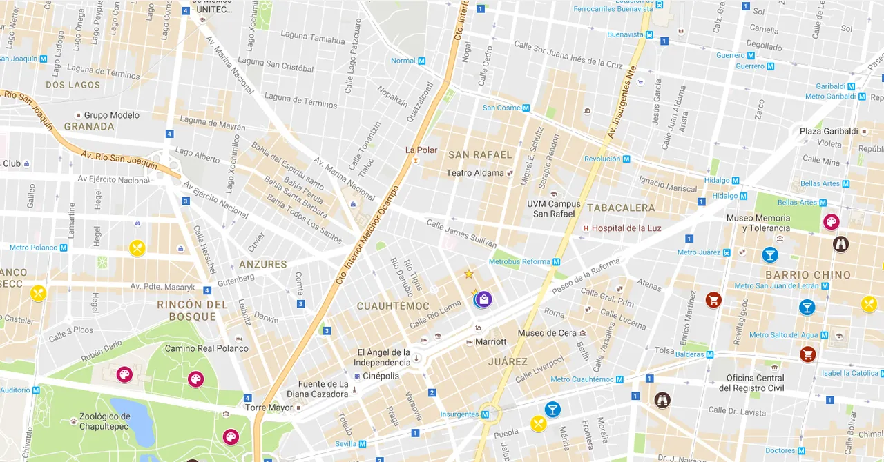
The Landmark: This is a constant point of reference. In a website, it's the logo that always takes you back to the homepage. In a new city, it's a tall building or a famous monument. A landmark gives you a sense of security and a clear place to start from if you ever feel lost.
The Compass: A compass gives you a sense of direction. It's not enough to just know where your landmark is; you need to know how you're moving in relation to it. On a website, this is a clear sense of the "main road" and the smaller "forked paths" you can take, with an easy way to get back.
The Minimap (or Breadcrumbs): This is a record of the past. Breadcrumbs on a website tell you exactly how you got to the current page. In real life, it's the mental map you form of your journey. A minimap helps you orient yourself and gives you a good sense of scale and where you fit into the larger picture.
By combining these three principles, you can create a system that is not only organized but also intuitive and easy to use.
The Ultimate Test: A Flat-First, Looping Website
With all these new understandings—from tree and flat hierarchies to sequential and faceted navigation—I have a clear goal: to build a website that challenges the traditional approach. A tree system starts small and gets big, but I want to go big then go small. A flat hierarchy is perfect for this, as it organizes a chain of things into a single, manageable section.
Therefore, in a flat-first website, all the content would exist on one long, continuous page. This would be a testament to my organizational skills and my ability to think outside the box. To make sure my users don't get lost, I would include a table of contents at the start of the page and use a clear, consistent sidebar as a form of breadcrumbs. This would give my users a clear sense of their location and a minimap to guide them.
This navigation system would be so robust that I could afford to play around with the structure of the site. I would make the page loop around seamlessly when the user gets to the end. The goal isn't to confuse the user, but to show that with a strong navigational foundation, you can create a unique, continuous, and memorable experience.


