Vendy Lee Candles
This project was a great lesson in client management and interpreting a vague brief. I was tasked with designing a logo for my mother’s new candle brand, Vendy Lee. My goal was not just to deliver a nice logo, but to create a brand identity that was a true reflection of her vision.
The Consultation: Reading Between the Lines
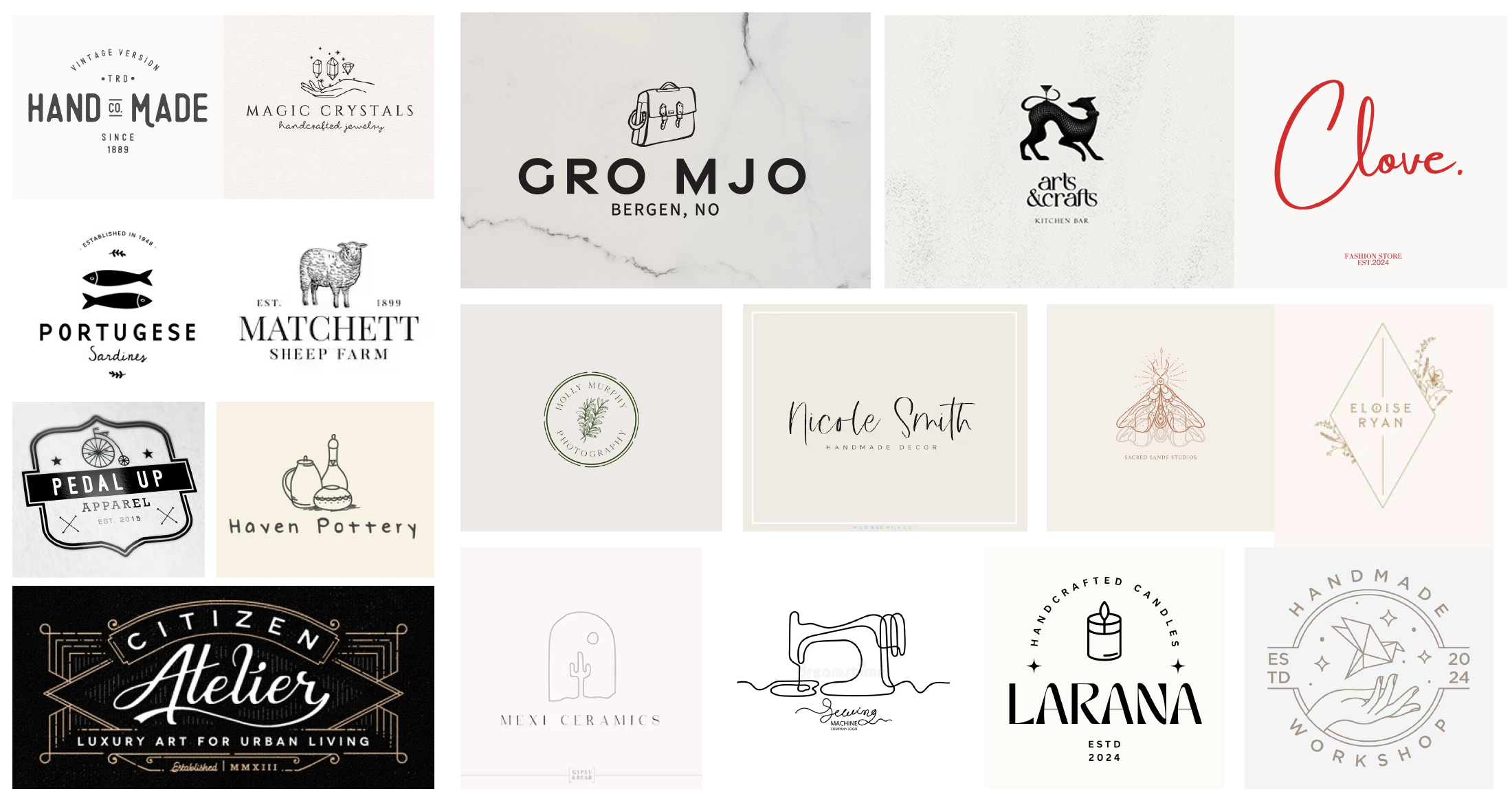
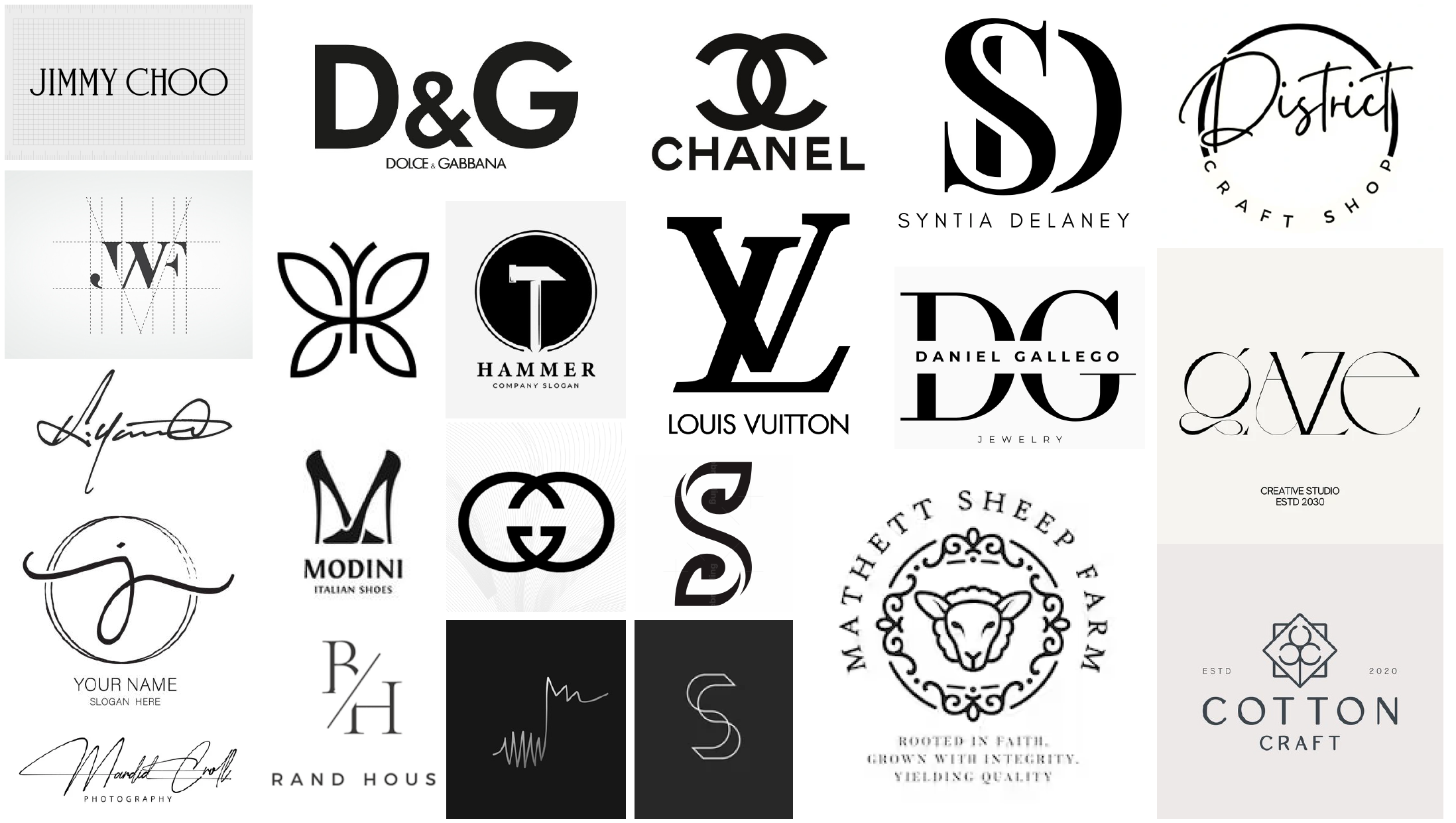
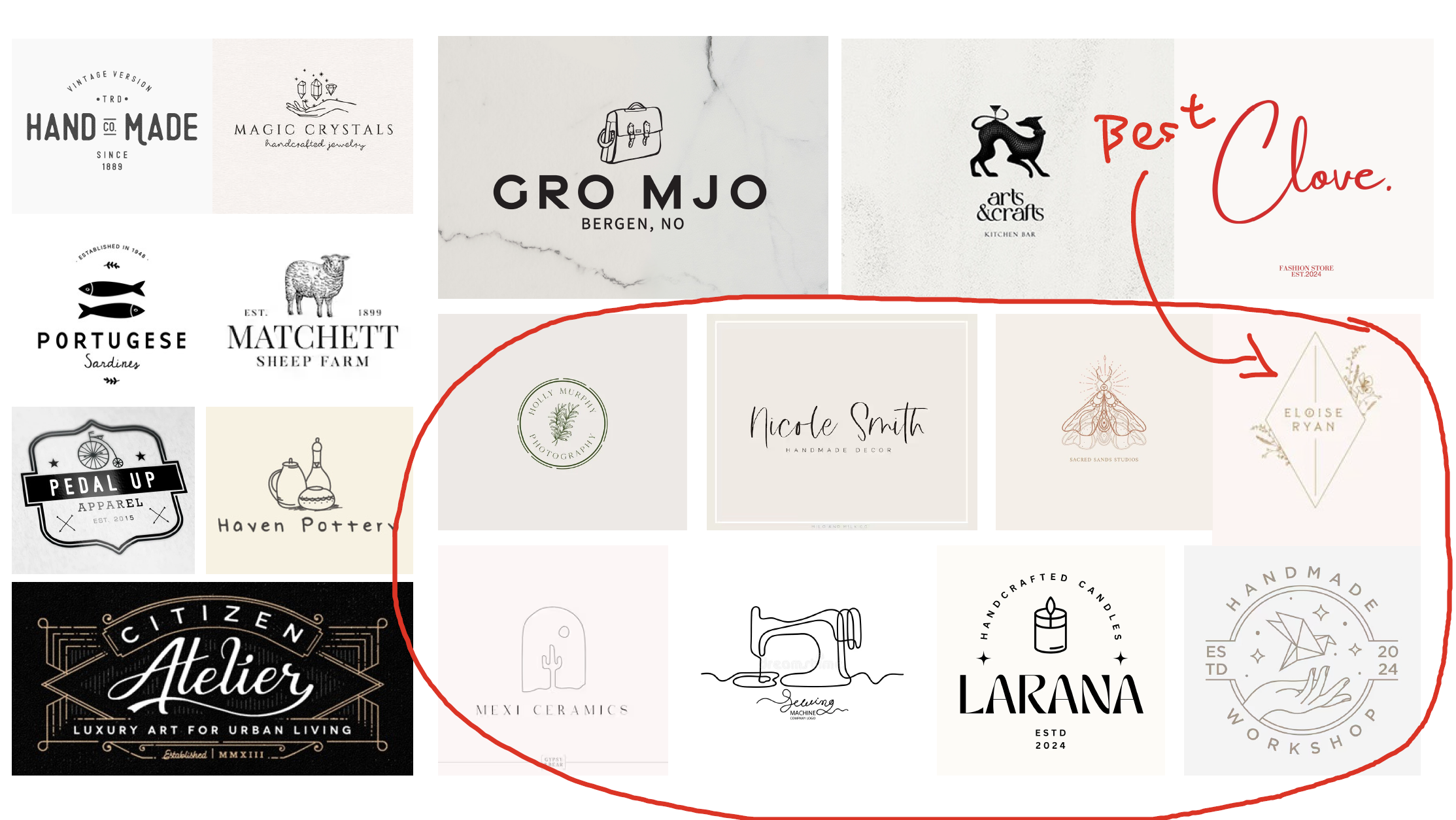
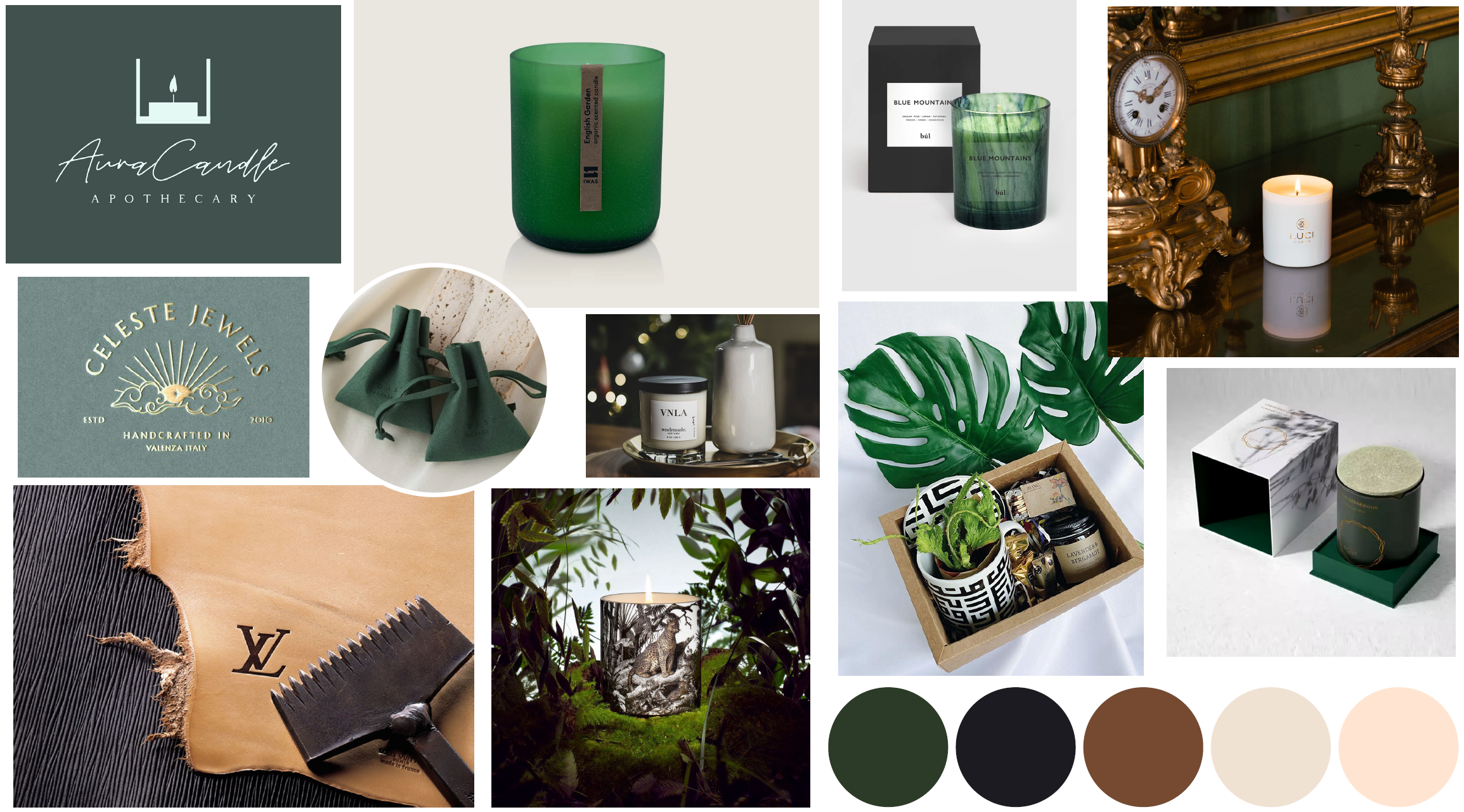
The project started with a "consultation session" where I tried to understand her vision. When I asked her what she was looking for, she said she wanted a logo like LV, since her name is Vendy Lee. I initially took this as a desire for a black-and-white, high-fashion aesthetic. However, I personally saw her brand with a warmer, more intricate feel—something with fine lines and a khaki color palette, like a Muji aesthetic. I had a hunch this was the direction she really wanted, so I proactively prepared a mood board with this look before our next meeting.
This visual tool was a turning point. By seeing the different styles laid out, she was able to pinpoint what she truly wanted: an elegant, fine-lined logo with a beige and khaki color scheme. It turns out my hunch was right. The LV reference was a desire for a brand that was just as recognizable, not a carbon copy. This taught me a valuable lesson: a good designer knows how to ask the right questions and how to interpret a vague brief through visual communication.
The Design Process: From Vague to Vision
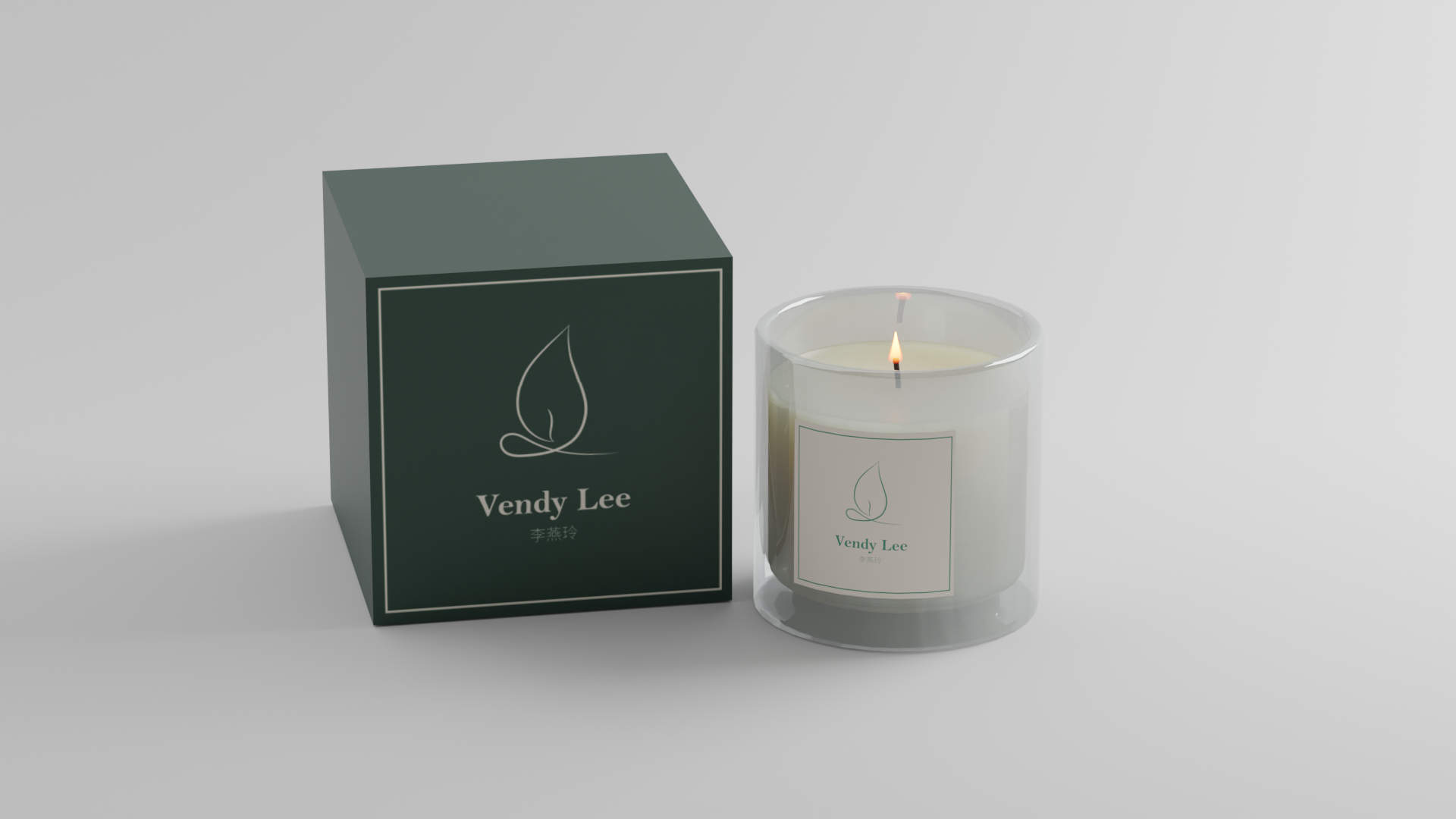
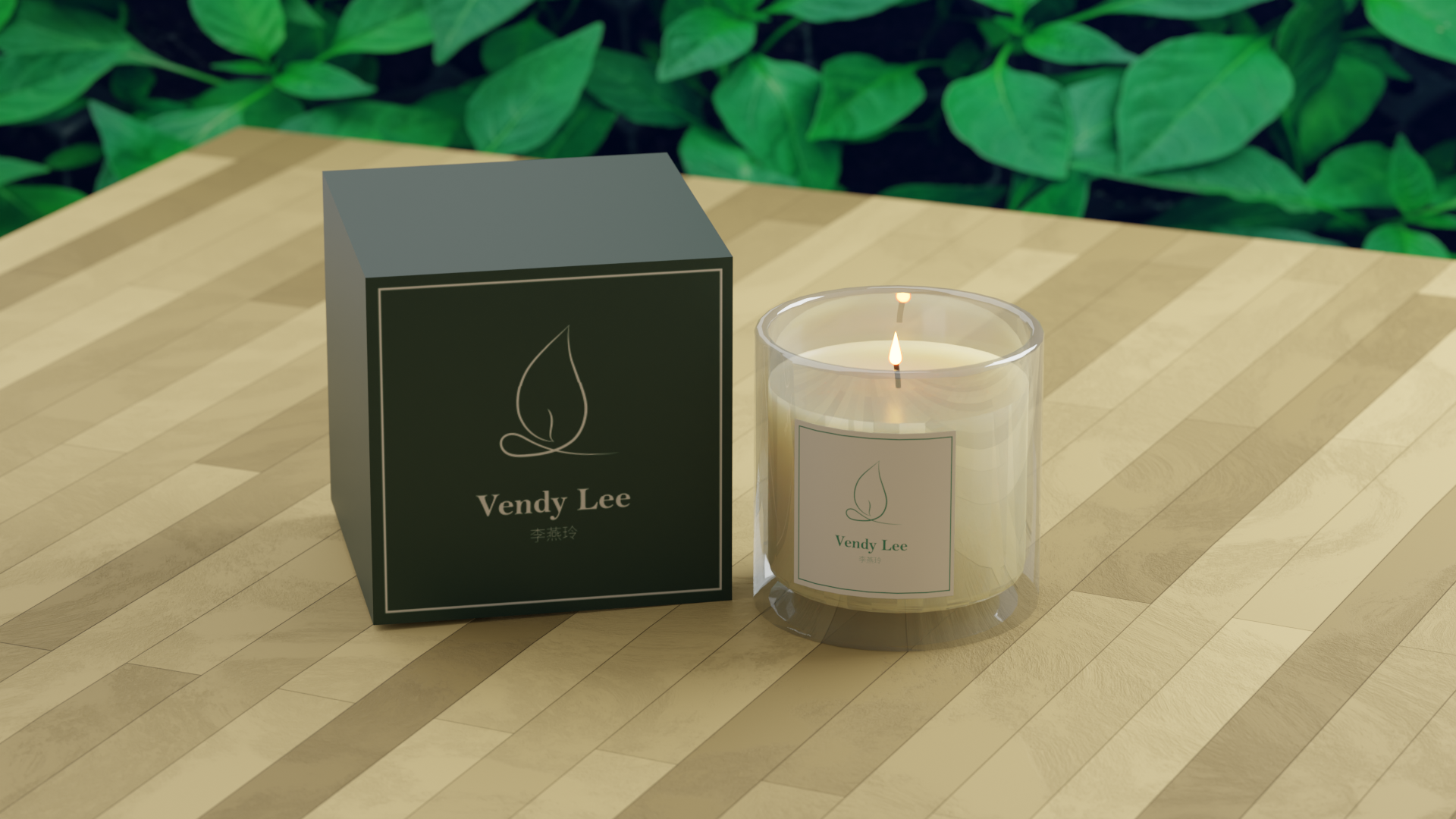
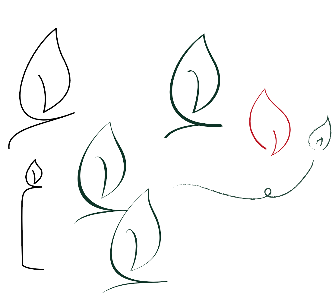
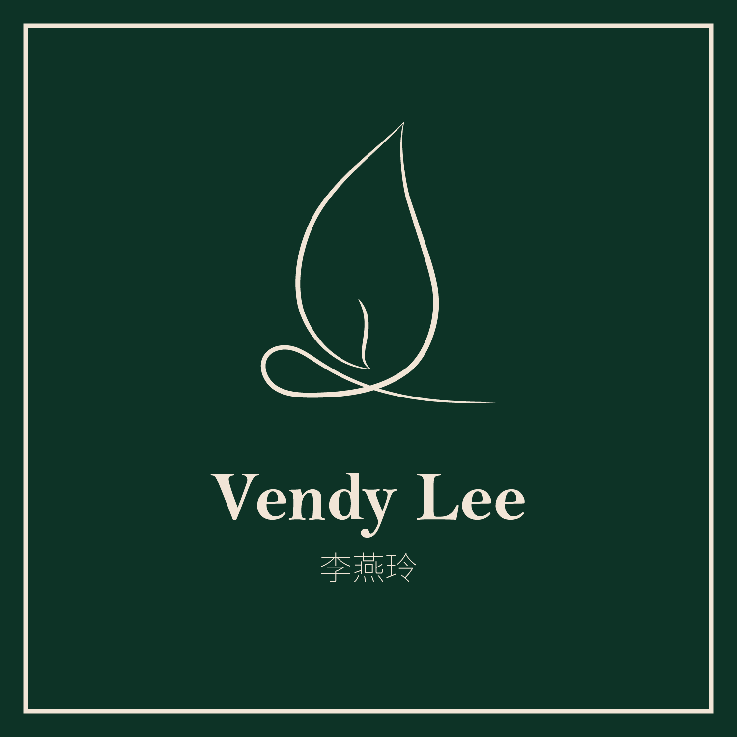
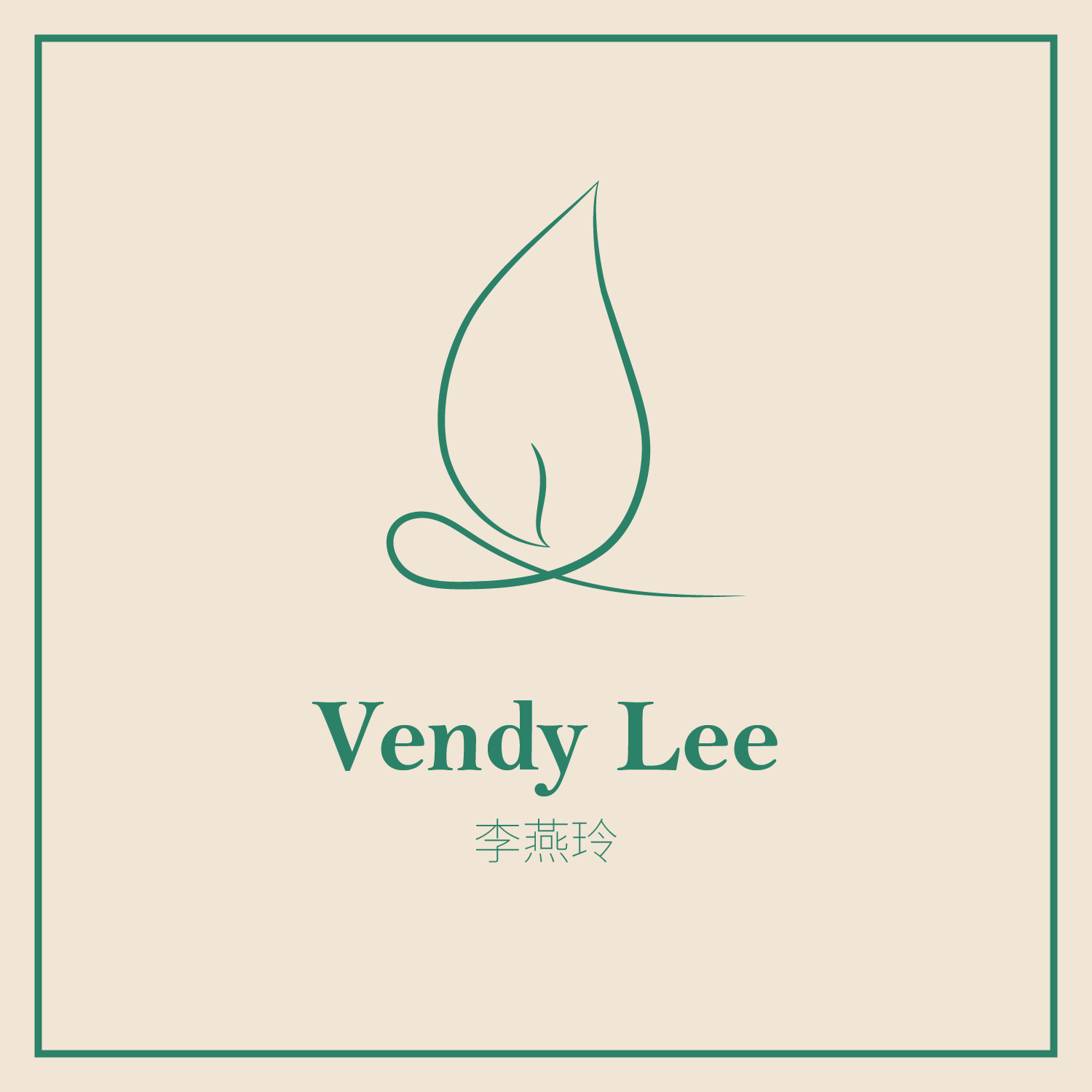
With a clear direction, I began the design process. I first tried to subtly incorporate a "V" into a flame motif. While I liked the idea, it felt generic, and I knew I could do better. I kept sketching until I finally found a beautiful design that cleverly integrated both the "L" and a "V" into a single, elegant symbol. It was a beautiful solution that would be great for brand recognition and gave me a clear starting point.
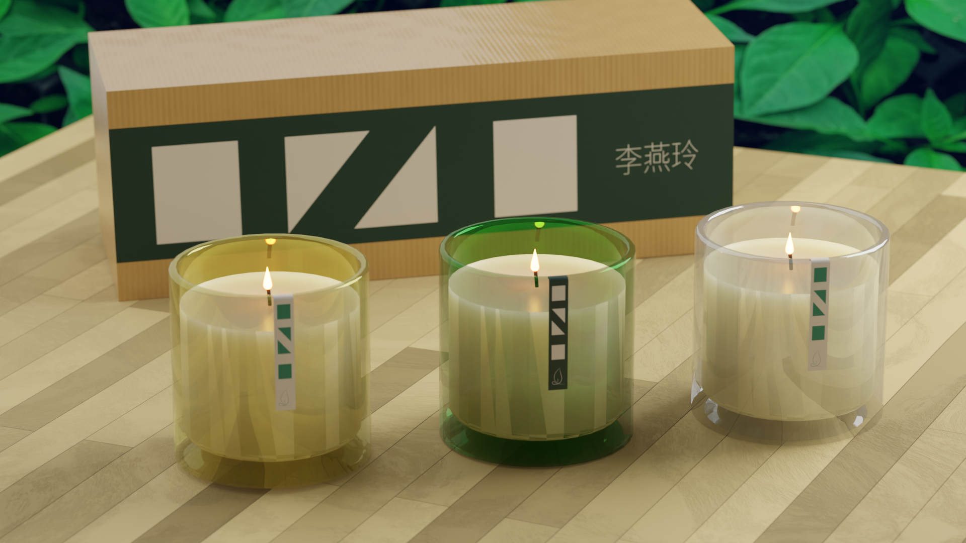
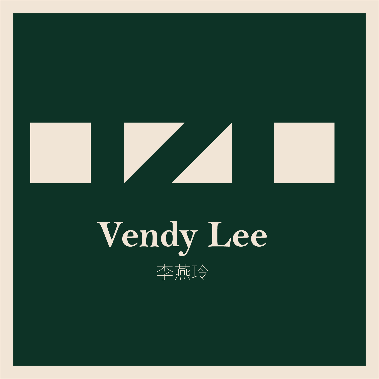
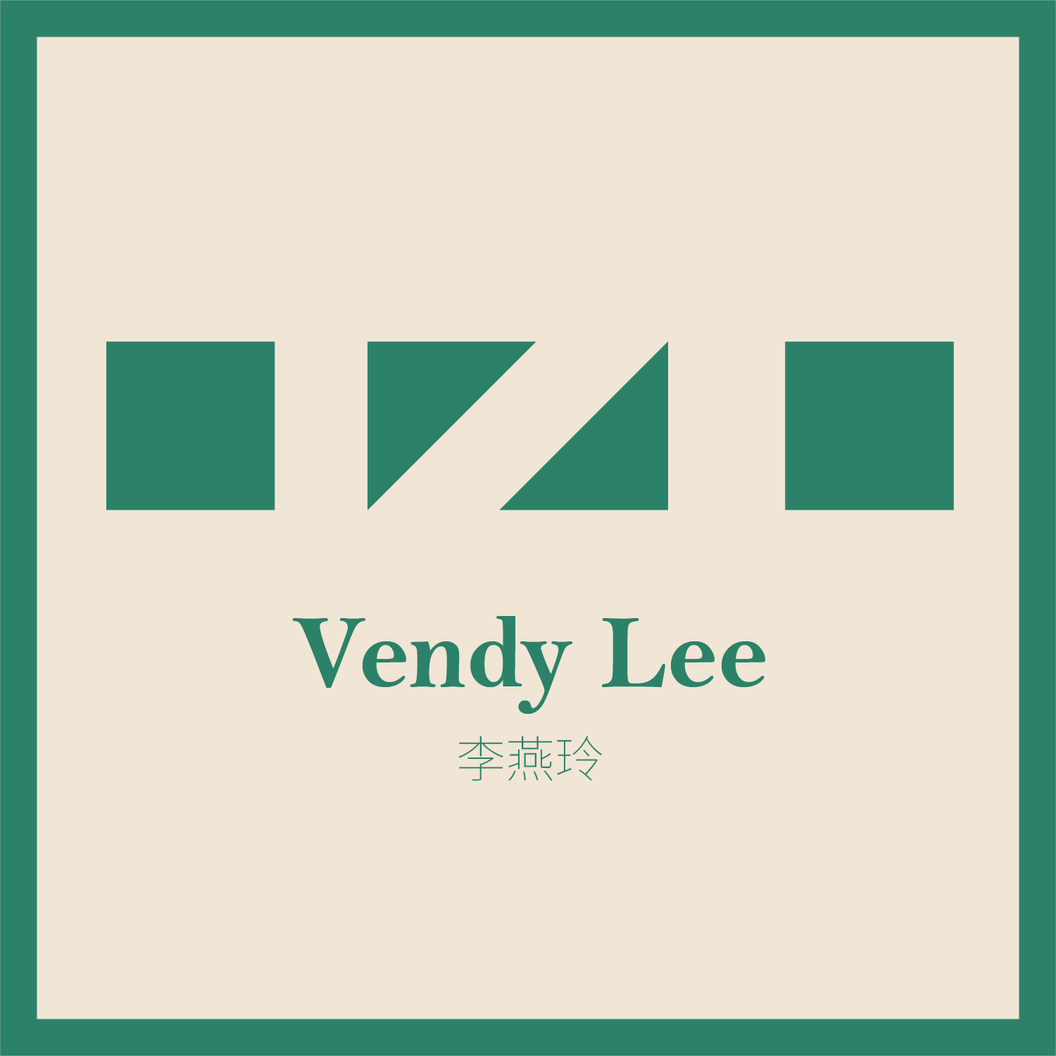
Through this process, I also had a crucial moment of self-awareness. I realized I wasn't as comfortable with fine-line design as I had hoped. So, I pivoted to a style I was confident in: a geometric, negative-space design. This was the same technique I used for my own He Square logo, and I applied it to her brand. The result was a bold, modern, and easily recognizable alternative logo.
I presented my mother with both the fine-line logo she wanted and the geometric alternative that I was good at. She loved both so much that she decided to keep them. This taught me that sometimes, the best way to satisfy a client is to give them something they asked for and something they didn't even know they wanted.


Bringing the Logos to Life
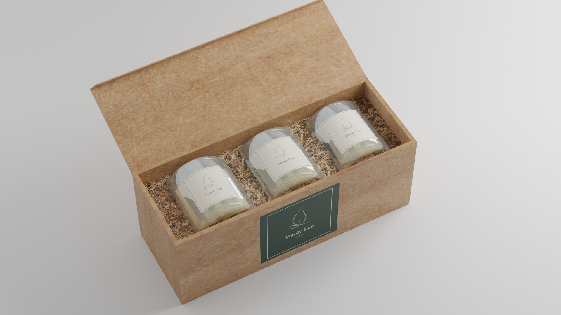
The final step was to visualize the logos on her product. While we could have simply printed them and attached them to the candles for a photoshoot, I wanted to go a step further. I created 3D renders of the logos on different candles and in various settings. This allowed me to show her exactly how her new brand identity would look in a real-world setting. This attention to detail and visualization gave her the confidence she needed to move forward with the project.
